Docs and support
Set up the first filter, then tune the details when your store needs them.
The docs cover the questions that stall most installs: where to place
the filter, how AJAX targets your theme, what mobile does, how URLs
behave, and how large catalogs hold up.
Is Fuzzy a WordPress product filter plugin?
Yes. Fuzzy is a WordPress plugin for WooCommerce stores. It adds product filters, AJAX filtering, mobile filter layouts, SEO URL controls, and a guided product finder.
Does it work with my WooCommerce theme?
Fuzzy works with most WooCommerce themes and includes selector settings, compatibility modes, debug tools, and troubleshooting guidance for custom product loops.
Can I use shortcode or widget?
Yes. Create a filter set, choose where it appears, and place it with a shortcode or widget on supported WooCommerce and WordPress pages.
Does it support product attributes and variations?
Fuzzy supports WooCommerce attributes and includes variation settings for filtering and counts. Use variation modes carefully when stock, parent products, and individual variations need different behavior.
Can I filter products without a full page reload?
Yes. AJAX filtering updates products, pagination, result count, active filters, available terms, and price range without a full page reload.
Can I control filter URLs for SEO?
Use query, hash, or clean URL modes with selected parameters, canonical rules, robots meta, noindex controls, and sitemap decisions.
How does filtering work on mobile?
A floating button opens the filters in a popup or off-canvas drawer. Mobile layouts, breakpoints, and touch-friendly controls let shoppers filter without losing the product grid.
Is it suitable for large catalogs?
Use index tables, cache, and count modes, and rebuild the index after big catalog changes. Pick lighter count modes over live counts as the catalog grows.
What is included in Free vs Pro?
Free gets a working WooCommerce filter you can test on your store. Pro adds deeper mobile behavior, advanced display types, styling, search and sort controls, guided selling, and large-catalog workflows.
Can developers customize AJAX selectors or CSS?
Yes. Developers use selector settings and compatibility tools for custom layouts. Styling depth depends on the selected plan.
Does it work with Elementor, WPML, and cache plugins?
Fuzzy includes compatibility tools for common WooCommerce stacks: page builders, multilingual plugins, and optimization plugins. Use the compatibility docs to adjust selectors or cache behavior.
 T-Shirt with Logo
$18 / t-shirt / black
T-Shirt with Logo
$18 / t-shirt / black
 Cap
$16 / accessory / blue
Cap
$16 / accessory / blue
 Hoodie with Pocket
$45 / hoodie / gray
Hoodie with Pocket
$45 / hoodie / gray
 Hoodie with Zipper
$45 / hoodie / green
Hoodie with Zipper
$45 / hoodie / green
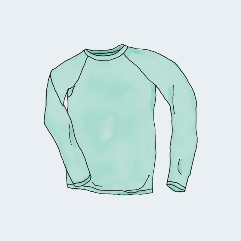 Long Sleeve Tee
$25 / t-shirt / gray
Long Sleeve Tee
$25 / t-shirt / gray
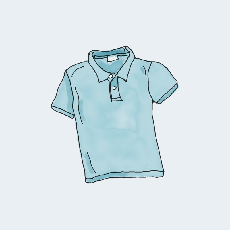 Polo
$20 / t-shirt / blue
Polo
$20 / t-shirt / blue